branding

Want Your Social Impact Website to Look Good? Start Here.

It takes about 50 MILLISECONDS (that’s 0.05 seconds) for users to form an opinion about your website that determines whether they like your site or not, whether they’ll stay or leave.

- SWEOR

Ummmmm….ok, that’s FAST (and scary!) That means your website needs to pack a visual punch in a hurry. So, let me ask you, how does your website look?

Does your nonprofit or social enterprise website look like it’s worthy of the dollars you’re asking people for, or does it look like you’re still trying to get your act together?

As a copywriter, obviously, I believe that the words on your site matter a great deal—and they do. But the first thing people will notice is the design.

And once you’ve made it past the hurdle of having a well-designed website that people stick around for, there’s something else you should consider that I see overlooked all the time, especially on DIY websites.

If you want your website to look good, you need to think about the consistency of your visual identity, or visual brand:

  • It needs to be unmistakeable.

  • It needs to be cohesive.

  • And it needs to reflect your organization’s mission and personality.

A simple tool that will help you get there is a style guide, or brand guide. With it, your nonprofit, social enterprise, or social impact company can look like a million bucks (even if you aren’t). Without it, your organization can unknowingly communicate that you’re an amateur.

Let’s talk about how you can create your own style guide, even if you don’t have a designer on staff.

Want Your Social Impact Website to Look Good? Start Here.

Let me give you two caveats before we jump in:

  1. I think, whenever possible, you should work with a professional graphic designer or brand agency. I regularly get compliments on my logo, website, and branding, and that’s because I went to the pros. Even as a marketing consultant, I couldn’t have done this on my own. They set me up for success. And certain colors make people feel a certain way, so depending on your area of work, there may be colors they can advise you to run toward, or run away from. (It’s not always just based on what you personally like.)

  2. If you weren’t aware by now, I’m not a graphic designer. I can Canva the heck out of a project, and I’ve art directed many times over the years, but it’s not my main focus. However, I keep coming across this problem with clients and friends, and felt the need to address it here on the blog.

Why DoES YouR Nonprofit or Social Enterprise NEED A STYLE GUIDE or brand guide?

Let’s do a quick refresher on what a “brand” is, in case you’re unfamiliar with the term, but nod along in a crowd like you understand, or in case someone made the mistake of telling you that a brand was a logo.

First of all, a brand is not a logo!

My designer friends really want you to know that.

This misunderstanding is where many organizations go wrong from the beginning.

In simple terms, think about your organization like a person. A person is made up of lots of characteristics, like what they look like and how they make you feel. A brand is similar. It’s all the little details, physical, emotional, and more, that make them who they are. So, it’s way more than just a logo.

Now that we’re on the same page, let’s talk about the importance of a style guide, also sometimes known as a brand guide. (I’ll distinguish the two of them for you below.)

A style guide, or brand guide, can be your best friend when you’re designing something new. This might be a website, social media posts, printed materials, or anything else that has a visual component.

Having a style guide (or brand guide) is important because it helps ensure that everything you design looks consistent and cohesive. It makes you look professional, and maybe even like you’re a bigger organization than your actual head count.

“The more cohesive and consistent you branding, the easier it will be for your audience to recognize you. Constantly switching up fonts, colors, and photography styles seems exciting, but it can actually cause you and your brand to get lost in the crowd.”

- Madison Beaulieu of Mad + Dusty

WHAT DOES A STYLE, OR BRAND, GUIDE DO FOR YOUR SOCIAL IMPACT ORGANIZATION?

Let’s think beyond social impact organizations for a moment.

  • Do you have a favorite sports team? I bet you can tell me what their colors are immediately.

  • FedEx and UPS? You can probably tell me their colors, too.

  • The Disney font? Yep, you can see it in your mind.

  • The Apple and Windows logos? They might be in front of you as you read this post!

  • The shape underneath the word Amazon? You’ve seen that curved arrow a million times.

See what I mean? When you think about brands that you know and love, you can instantly recall their logo, colors, fonts, and more. Their visual identity is the same no matter where it shows up.

What if you went to the UPS website and saw neon green everywhere? It would stop you in your tracks, and you’d probably wonder if someone hacked their site.

This is why you need to think about creating a style guide for your nonprofit or social enterprise. You want people to have the same, thoughtful experience with your brand.

You should think about a website, social media posts, and collateral as all part of the same family. The design, look, and feel should be intentional and made to go together.

Brands with a consistent visual identity look more professional and trustworthy.

Don’t unintentionally send up red flags to your donors and customers with a brand that looks haphazard and amateur. You’ve worked too hard for that—even if you’re just starting your nonprofit.

Plus, it can be hard enough to keep your brand consistent when it’s just you, but add team members into the mix, and it can get out-of-hand quickly. This is especially true because, if you don’t have any guidelines, people may choose what they personally like best, whether you’d consider it in-line with your brand on not.

“Brand guidelines are so important. You need more than just a logo, you also need a guide to using your branding across both print and digital media. Stick with the same colors, fonts, and photography styles. I know it can feel boring to you after a while, but it’s not to your customers! You're in it every day, whereas your customers or donors may only interact with you once or twice a month, or even just a few times per year.”

- Madison Beaulieu of Mad + Dusty

TWO EXAMPLES OF WHAT CAN HAPPEN WHEN YOU DON’T HAVE A STYLE GUIDE

As I mentioned above, having an inconsistent visual identity often shows up in DIY websites. And why wouldn’t it? That probably means that the site is usually create by someone who is not a professional designer, so it makes perfect sense that they wouldn’t know better.

However, it can happen even when you hire someone to design your website. Let me give you two examples:

Client #1:

One of my clients is a nonprofit who has been around for over 15 years. They do incredible work overseas, but like many nonprofits, they bootstrapped, utilized volunteers, and called in favors when it came to their website design.

I started working with them on what I think was the third iteration of their website. I was asked to audit their marketing and communications before they launched their brand new website to their donors and stakeholders.

What I immediately noticed was that their brand lacked cohesion. A lot of the same colors were used in the design, thanks to a WordPress template, but the colors in the photos were all across the board. So, they didn’t have a look and feel that I could easily identify as theirs.

In fact, in 15 years and three websites, I was the first person to suggest that they use a cohesive color scheme or color palette! They really liked the idea, but had never heard it before.

Now, they have a color palette that they intentionally chose, and use it as a guide for anything new that they create. And it’s helped them look more polished, which is a better reflection for their years of experience.


Client #2:

Another client is a for-profit social impact company, who also works on a global scale. He’s been in business for about 10 years, and is currently in the process of launching his company’s second website.

The same graphic design agency who built his first website is completing the rebrand. Not long ago, he and I sat down to discuss the changes that should be made before the site goes live.

In clicking through the pages and links, he stopped on one page in particular, which had caught his eye for a very good reason!

He said, “I don’t like the photo at the top. It just doesn’t feel right.”

And he was correct. The stock photo on this page was completely off-brand. His colors are bright blue, red, and gray, for the most part. This photo was pastel. So, he couldn’t articulate why “one of these things was not like the other,” but he knew something was wrong.

This example goes to show you that even professionals can make a mistake. And it again reinforces the importance of having a style guide. If he had been given a style guide, or if the designers had been working with one, they would have immediately been able to see that the photo didn’t make sense.

how to diy a STYLE GUIDE OR visual brand guide

When we’re talking solely about design, I prefer the term style guide. If we’re talking about the brand as a whole, down to the brand message and brand voice, I like the term brand guide. But I wanted you to be aware of both because they’re frequently used interchangeably.

So, whether you DIY’d your website and need to create a style guide, or your graphic designer didn’t provide you with one, let’s talk about how you can create your own.

Basics to Include in Your Style Guide

Here are the nonnegotiables you should include in a style guide:

  • Logo colors and usage: What are the correct proportions of your logo, and what colors should it only appear in?

  • Brand mark colors and usage: Do you have only a portion of your logo that gets used from time-to-time? If you look at your website tabs above, you’ll see that mine is just the lightbulb part of my logo. (This section of your style guide can also include icons that you frequently use.)

  • Brand color palette: You’ll likely have two to four main colors that should be front-and-center at all times. Then you should have another two to four-ish that get used only as accent colors. As an example, my primary colors are red, yellow, and light gray. My accent colors are a teal, dark gray, and two other green-ish colors. Of course, they all have fancy names, but this gives you an idea.

  • Typography: What are your fonts? You probably have a primary font and one or two secondary fonts. My primary font is Raleway and my secondary is Arvo. This gives me a sans serif font and a serif font to play with.

“Let your branding be a reflection of your values. Design trends come and go, but values rarely change. Personal values (honesty, courage, kindness) spill into your business. It's a great place to start when thinking about how you'd like to translate your business to the visual space.”

- Madison Beaulieu of Mad + Dusty


other ideas IN CASE you want to go the extra mile:

  • Mood board to give examples of colors, photos, and textures

  • Basic details about your organization that might affect the visual design, such as values

  • Key messages to keep in mind and reinforce when sharing in different formats such as a website or social media

  • Contact info in case there are any questions or decisions to be made


Want to include the entire kitchen sink?

Create a brand guide that encompasses the A to Z of your organization. One of my clients has a brand guide that’s 100 pages—no joke! But you don’t have to go that far.

Here are additional components for your brand guide:

  • Examples of what was done well in the past

  • Market research or details about your target audience, including words and emotions that represent them and what they’re looking for from your organization

  • Goals and objectives for different mediums, such as how specific stories should be used or what is considered a win

  • Brand message and brand voice, including words and sentiments that should and shouldn’t be used


Which is right for you?

I think just starting with a basic style guide is a terrific idea, especially if you’re a small nonprofit, social enterprise, or social impact company. If you’re a little larger, or frequently utilize contractors and freelancers, I think you should expand your guide to ensure that your brand stays tight, even as it grows.


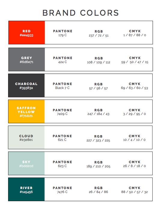
SIGNIFY’S Brand Guide As An Example

Want to see what a brand guide looks like? Here’s mine!

Click the image below to see the full, nine-page PDF.


3 PRO TIPS to Help You Keep Your Brand Consistent

1) Pinterest

What do you do if you don’t have a graphic designer handy, don’t know what your colors are outside of “green” and “blue", or don’t consider yourself a style guru?

You turn to Pinterest!

And you thought it was only for recipes and hair styles . . .

Head on over to Pinterest, and type in some variation of “color scheme", such as “light green color scheme”, for example. There are thousands of color palettes already put together by professional designers that you can use!

Just type in one or two colors plus “color scheme” or “color palette” and you’ll be amazed at what you see. This is exactly what I suggested to my nonprofit client above, and they quickly found one that worked for them.

2) Canva

I can’t believe how many people still don’t know about Canva! This amazing (and free) website lets anyone become a competent graphic designer. There are hundreds of templates for social media posts, presentations, flyers, and much more. You can even pre-set a couple of your main brand colors so that they’re always handy.

But use responsibly!

Just because you have so many templates at your disposal doesn’t mean you have to use them all! The idea is to create consistency, right? Find a template that can be used over and over again for social media posts, brochures, flyers, presentations, and more.

My Canva account is set up for my social media posts, Pinterest posts, and more. So, when I or my interns log in to create new ones, all we have to do is make a copy of a previous design. This keeps the same look and feel intact each and every time. Remember, you want a brand that is recognizable.

3) Professional Photography

Of course, we can’t talk about a style guide or brand identity and leave out photography. But if you don’t have a photographer on staff or aren’t planning a photo shoot anytime soon, you want to find photos that both look good and also fit within your color scheme.

For this purpose, I like Unsplash. But other great options include Pexels, Pixabay, and Pikwizard. These are all royalty-free sites, meaning you don’t have to pay to use the photos. Choose whichever site has the best options for your brand.

In Unsplash, I have an account so that I can earmark photos that work well for my brand as I come across them. Because I post on this blog twice per month, I’m always searching for new photos, or looking to see what I’ve already saved. This not only makes them easy to find in the future, but again, my interns can choose from photos I’ve already approved.

Before I go, let me reiterate: I still suggest working with a professional designer whenever possible. They can help you set up colors and templates to use on your own when you can’t afford them, or are capable of creating something in-house. I never would have achieved the consistency that I have no without help from the pros in the beginning.


PIN THIS POST FOR LATER:

Does your nonprofit or social enterprise website look like it’s worthy of the dollars you’re asking people for, or does it look like you’re still trying to get your act together?

Kristi Porter, founder of Signify

I’m Kristi Porter, and I help cause-focused organizations understand and execute effective marketing campaigns so they can move from stressed to strategic. Your resources may be limited, but your potential isn’t. Whether you’re a nonprofit, social enterprise, or small business who wants to give back, I’ll show you how to have a bigger impact.


Why Your Social Impact Mission Isn't Enough

  • Have you ever read an entire nonprofit or social enterprise website, only to find yourself still wondering what they actually do?

  • Have you ever had a fantastic conversation with someone about their mission, only to find that their website lacked the same passion?

  • Have you ever seen an organization use different styles and tones across their social media, website, blog, and even when they speak in person?

If you’ve seen any of these issues in action, you’re witnessing a lack of clarity and consistency in the nonprofit or social enterprise’s brand message or brand voice.

They probably know internally what they do, but it may not be translating well outside of their walls. And, as you can imagine, that’s a big problem, especially when trying to find new customers, donors, and partners.

For your mission to not only engage the right people, but compel them to act, you need a clearly defined brand message and brand voice. You may think of your “brand” as only part of your marketing, but your brand informs what you say, how you say it, and what your mission looks like visually. It’s essential to every aspect of your organization.

With a strong brand message and brand voice, people will know what you do, why it matters, and how they can be a part of it. Without it, people could be left confused or even apathetic to the incredible work that you’re trying to do.

Let’s talk about how you can make your effort more effective.

Why Your Social Impact Mission Isn't Enough

Why Is knowing your brand message Important to Your Nonprofit or Social Enterprise?

I’ve already mentioned how having a strong brand message and brand voice contributes to your bottom line, but before we move on, I want give you a couple of other reasons why this subject should be on your radar.

Do you ever write about your nonprofit or social enterprise? Do you have employees, board members, volunteers, or other key stakeholders that talk about your mission? Have you ever hired a third-party contractor, freelancer, or intern that communicates on your behalf in person or online? If any of these situations apply to you, so does this topic.

Having a clear and consistent brand message and brand voice ensures that everyone (including you) is talking about your organization in the same way.

It helps everyone communicate the right message in the right way. To put it simply, it gives every person a common language to use, and a template to work from. One of my clients even called it her compass because it guides her in the right direction, and steers her back when she gets off track.

Wouldn’t it be great if everybody used the same playbook?

Even if your nonprofit or social impact company is just you right now (hi, fellow solopreneur!), a solid brand voice allows you to talk about your work in a way that resonates with the people you want to reach. Meaning, people get excited when you talk about your mission! No more difficulty trying to explain what you do, watching someone’s eyes glaze over as you struggle to reach your point, or your message falling flat when you simply recite your mission statement.

What Do People Say About You?

Jeff Bezos is often quoted as saying, “Your brand is what other people say about you when you’re not in the room.” And while I think there is a lot of truth to that, I also like how my friend, Jaci Lund of Treebird Branding, states it, “A brand is an expectation.”

No matter how you look at it, though, a brand isn’t just a logo, an elevator pitch, a mission statement, a color palette, or even a website. Your brand is the culmination of all of these things and more.

If your organization were a person, your brand would be all the little characteristics that make that person who they are.

It’s a lot, I know.

For now, we’re going to talk about your brand message and brand voice, which are two of my favorite characteristics. And, without clearly defining these two pieces, your brand’s puzzle is incomplete. Without them, it could mean that donors and customers don’t connect with your mission, resulting in stagnant sales or donations. It’s that important.


Brand Message and Brand Voice Defined

Think about the companies or nonprofits that you love most. One of the reasons you probably love them is because you know some of their background, what they stand for, what problems they solve for you, and where they’re headed in the future. You know their story, and you know how you fit into it. In that way, they’re a little like a friend you’ve gotten to know over time. 

You’ve had these ongoing conversations with them internally and externally via their brand voice. Whatever they said, and however they said it, made you a fan out of you. And we want that same thing for your audience.

Your brand message is what you want people to understand about your organization.

Your brand voice is how you communicate your organization’s message to others. 

Essentially, your brand message is your mission, and your brand voice is your mission in motion. You can’t have a clear and compelling brand voice without first defining a strong brand message.

Your brand voice is the specific mix of words and tone that you use—not just what you say and do, but how you say it. A great brand voice is easy-to-understand, consistent, repetitive, and uniform no matter where it shows up. And it always reflects your organization’s core message.

That means the words on your website, your social media posts, the conversations you have with people, anything you say from a stage, emails, printed materials, packaging, advertising, and more should all be using the same language and emotion to describe your work, mission, and vision. Think of it like your unique vocabulary and personality rolled into one.

You want people to hear your “voice” and know it’s you, with or without your logo or photo present. Like your own distinct personality, your brand message and voice is what will help authentically attract others to you.

Having a firm grasp of how to communicate your story, mission, and vision in all your marketing and communications will help you attract the right (and more) donors, customers, sponsors, and partners.

A Brand Message in Action

Not long ago, I was out with my friend, Katrell, who owns Dr. Bombay’s Underwater Tea Party here in Atlanta, and also founded the charity project, The Learning Tea. While I was waiting for her at the tea shop, a guy sat near me at the community table. He was looking around wide-eyed like it was his first time there. In fact, when he caught my eye, he gushed, “This place is awesome! I’ve never been here before.”

We chatted for a minute, and I told him that the proceeds from the tea shop put girls through college in India. Turns out, he was at the tea shop waiting for an event to start just a few blocks away. It was a social impact arts show, so he was thrilled to know of the store’s greater purpose.

After Katrell and I left the tea shop, we went to a nearby restaurant and sat at the bar. While chatting with the bartender, we found out even though he’d been in the Atlanta area for a while, he was only recently taking the time to discover the local haunts. And he actually mentioned going to Dr. Bombay’s recently. As the unofficial brand ambassador, I mentioned that Katrell was the owner. He got so excited, threw his head back and his arms up, and said, “That place is like a warm hug!” He loved the unique, but cozy vibe.

A couple of hours later, Katrell and I were about a block away from Dr. Bombay’s, peeking in the glass windows of a store that was yet to open, trying to figure out who her new neighbor would be. A man rode by on his bike and struck up a conversation with us. We all noted that the architecture of this building looked very out of place on that street, so we were curious about it. The guy said, “I wonder what Dr. Bombay will think about this building?” To which I replied, “This is Dr. Bombay!” while pointing at Katrell. He laughed, smiled, and said, “I love your shop! It’s one of the only places I let my kids ride their bikes to in the neighborhood.” (And then proceeded to tell her which ice cream flavors she should swap out, ha!)

True story—all three of those conversations happened in a matter of hours. It was a marketer’s dream come true!

So, out of these three men, which one nailed the brand message?

The answer: All of them. Each of them found something about Katrell’s tea shop that resonated with them. And, for that reason, each of them was going to come back.

How to Define Your Brand Message and Brand Voice

Okay, so now that we’ve talked about how utterly important it is to have a clear and consistent brand message and voice, as well as who it benefits, let’s talk about how to get you there.

Here are a few questions to think about regarding your brand message:

  • What are the two or three top things someone should know about your work?

  • Why does your work matter?

  • What makes you different from your competitors?

  • What problem do people have that you solve?

  • What is the transformation you provide?

Here are a few questions to think about regarding your brand voice:

  • How do you want people to feel when they think about your organization?

  • How does your audience describe themselves?

  • What words and phrases do you find yourself repeating over and over again?

  • What words or phrases would you never use to describe your organization or work?

  • What tone should your organization communicate in? (ex: serious, playful, authoritative, compassionate, etc?)

Hopefully, these questions will get you started, but if you get stuck or need help, I’m here.

I can guide you through my own five-part framework for defining your brand message and brand voice.

I’d love to help you communicate more effectively, so that your work gets the attention it deserves.

Here’s what one of my clients said:

Jaycina Almond, The Tender Foundation

Kristi’s Brand Message Consultation serves as a "compass" for everything from communications to fundraising to partnerships and more. It really lays out the language you can use in your website, newsletters, presentations, and social media to stay true to the organization’s mission and values. You can reflect on anything that you are working on, and quickly see if it aligns with the current narrative.

During the consult, we really dug deep into who we are, why we do what we do, what makes us different, and more. Afterward, it's spelled out in a document right in front of you that you can always refer back to! It’s so helpful.

The Brand Message and narrative that we worked on really boosted my confidence in being able to explain what we do and what makes us different. And I think having that solid foundation really helped me to secure early grants.

- Jaycina Almond, The Tender Foundation


PIN THIS POST FOR LATER:

For your mission to not only engage the right people, but compel them to act, you need to ensure that you have a clearly defined brand message and brand voice. You may think of your “brand” as only part of your marketing, but your brand informs what…

Kristi Porter, founder of Signify

I’m Kristi Porter, and I help cause-focused organizations understand and execute effective marketing campaigns so they can move from stressed to strategic. Your resources may be limited, but your potential isn’t. Whether you’re a nonprofit, social enterprise, or small business who wants to give back, I’ll show you how to have a bigger impact.


Ask the Experts: Design and Branding for Social Impact Organizations

As a copywriter, I love talking words. But, in order to serve you well, I can’t ignore the visual side of your marketing and communications. So, when it comes to design and branding for social impact organizations, I can dish out some pretty good advice, but my secret weapon is the company I keep.

I’m friends with some pretty terrific graphic designers, and Jaci Lund of Treebird Branding is one of my favs. Take a look at her site, and you’ll see what I mean.

Branding and design for your nonprofit, social enterprise, and social impact company can probably feel a little overwhelming at times because you know it’s important, but your mission comes first. So, not a lot of time and dollars usually get allocated to your visual identity. Or, you’re so busy juggling more important things that you have no idea what the latest design trends are that you should be keeping up with.

If you feel like you’re out of the loop on this topic, Jaci is going to clear some things up for you. And, better yet, she’ll tell you where should focus your efforts. Sound good?

Ask the Experts: Design and Branding for Social Impact Organizations

Q. What are the latest trends in design and branding for social impact organizations?

A. I’d like to start with something a bit counterintuitive: Ignore trends! A trend, by definition, is fleeting. Mission-driven organizations like nonprofits and social enterprises that chase trends end up looking dated and out of touch within a year or two. Trends also are defined by the external zeitgeist, and your true north needs to be your own mission and vision.

So instead of chasing the latest trend, I’d say to focus on you and your target audience. You know what you stand for, you know what your audience responds to. Focus on that and ignore the noise.

Q. What is the biggest mistake you see people making in regard to design and branding?

A. I would say confusing a logo with a brand is something we encounter a lot. A logo or wordmark or tagline is essential to your brand, but it’s only a very small part of your brand.

The colors you choose also elicit very specific reactions. Your photographic style tells your story in the way you want it to be perceived. Your fonts, your website’s information architecture, all of these align with your brand.

When you only give power to your logo to carry your brand, you’re missing out on a truly holistic experience. And your donors, customers, and prospects will notice.

Q. What is your best piece of advice to those wanting to improve their social impact organization’s visual identity?

A. I’m going to roll with the counterintuitive again. You should be bored with your brand. That’s to say, your brand needs to be so consistent that it becomes ho-hum in your life.

Do you think the Nike designers love putting the swoosh on every sneaker, day after day, year after year? Probably not. But they get to design the sneaker around the swoosh. Those are the parameters.

You have to put your brand within a box, and then true creativity emerges within that box. But if Nike did a swoosh one year, a chevron the next, and then a representation of the Greek goddess of victory, how would you even know they were Nike? This also relates to the chasing trends fallacy. Be true to yourself, and your best-fit audiences will find you and stick with you.

Also, you are not your audience. You have to stare at your brand every day. But your audience has fleeting experiences with your brand. You need to always remind them of who you are and what you stand for. And that means consistency, consistency, consistency.

Q. What is one thing readers can do this week to improve their nonprofit or social enterprise’s design and branding?

A. We can all do a brand self-audit. I liken this to the Konmari method: If any of your collateral doesn’t spark brand, get rid of it.

There are a few great quotes from writers about this. Hemingway talked about having a “built-in, shock-proof shit detector” when it came to editing. Faulkner famously said “you have to kill your darlings.” All of that means you need to take an objective, dispassionate look at what you’re presenting to the world and make hard choices to edit what’s not on-brand.

Get rid of the precious and keep the essential.

Q. Anything else we should keep in mind?

A. Do less and remain consistent rather than do more and risk inconsistency. Branding is about focus and sacrifice more than about expansion and add-ons. A tight brand is a memorable brand. An expanded brand almost always gets diluted and confused in the minds of prospects.

Q. Do you have any resources that would be helpful so people can learn more?

A. It’s a bit of a dinosaur at this point, but The 22 Immutable Laws of Branding by Al and Laura Ries is a standard for a reason. Also Made to Stick by Dan and Chip Heath has very sage and actionable advice.

Thanks, Jaci! Excellent info!


Jaci Lund of Treebird Design

Jaci’s quick wit, intent listening, and native intelligence come across as soon as you meet her—and carry over to her branding and graphic identity solutions at Treebird Branding, where she fuses strategy and sophistication, daring and restraint in just the right doses. With a dual focus on creating original branding for new concepts and revitalizing the look and feel of even the most-established brands, Jaci approaches each project with a fresh, thoughtful, and insightful perspective.

Facebook I Instagram


PIN THIS POST FOR LATER:

Branding and design for social impact organizations doesn’t have to be complicated. These FAQs will tell you what to pay attention to and what to ignore to make the most use of your time.

Kristi Porter, founder of Signify

I’m Kristi Porter, and I help cause-focused organizations understand and execute effective marketing campaigns so they can move from stressed to strategic. Your resources may be limited, but your potential isn’t. Whether you’re a nonprofit, social enterprise, or small business who wants to give back, I’ll show you how to have a bigger impact.


Ask the Experts: Branding and Design

Each month, I'm inviting guest contributors to speak about additional timely, relevant and sought-after topics that are important for cause-focused organizations to be aware of as they grow. First up, we have my friends, Madison and Dusty Beaulieu, who expertly designed my branding and website!

Mad & Dusty is a creative team for nonprofits and purpose-driven brands.

Q. What are the latest trends in your industry?

A. There’s definitely been a leaning toward illustration and texture. (YAY!) Flat design is huge, but now designers are taking that minimalism and giving it over to the artists. The desire for perfection in design is being replaced with a need for history and personality. We want to see the human hand in design now. Watercolor, paint, printmaking, hand lettering . . . the arts are showing up in a big way through design, and we love it.

Q. What is the biggest mistake you see people making in terms of their brand?

A. People give logos more credit than they deserve! Your brand is your tool box. Your logo, type, colors and patterns will help show your customers who you are in the same way that the clothes you’re wearing tell others a bit about who you are. Think of your logo as an accessory. If your purpose and brand values are not clear, appealing, and meaningful, an amazing logo won’t be able to fix that. Purpose and values are the foundation for your brand, and a good designer will help you clarify them before jumping into the logo design. Design that comes from the core of your business will work no matter what’s trending.

Q. What is your best piece of advice for people during branding and design, especially for those who are new to, or overwhelmed by, the process?

A. Be sure you understand the investment and what it will mean for your business. The branding process is not something to jump into half-heartedly. (We would make How to Style Your Brand by Fiona Humberstone required reading if we could.) The first six months of any business are unpredictable at best. I recommend that you quick-design a temporary logo using a template from Canva or another app, and build a one page site on Squarespace. After six months, sit down with a designer and discuss taking your business to the next level with an original brand. The branding process should feel like a celebration of your hard work and hustle. It’s an exciting time!

Also, find a designer that you trust and enjoy working with, even if you technically don’t need one now. It’s kind of like finding the right doctor. When something comes up, it will be good to know who you’d turn to.

Additionally, don’t be afraid to talk honestly about your budget. If a designer is passionate about what you do, they may be willing to find an agreement that works for both of you.

And, finally, not all design is branding design. We work with several clients for 5-10 hours per month on designing emails, social graphics, and those random little items that come up. We love partnering with them, and they love delegating those would-be headaches.

Q. What is one thing readers can do this week to improve their brand presence, either online or in print?

A. Make sure you’re using all the same fonts on documents. (No more than three different fonts.) It’s the smallest thing, but it will instantly give your brand a sense of cohesiveness. Typography works very subconsciously. Make sure it’s working for you!

Q. Anything else we should keep in mind for our brand, website or graphics?

A. Be true to your values. Be consistent with your community. Be honest about your capacity. Simple, purposeful things done consistently make a brand shine.


mad_dusty-168-2.jpg

Mad & Dusty is a creative team for nonprofits and purpose-driven brands. Starting in 2015, Madison and Dusty Beaulieu have worked with over 40 purpose driven organizations to tell important stories through art and design.

Find them online at www.madanddusty.com.


PIN THIS POST FOR LATER:

Mad & Dusty is a creative team for nonprofits and purpose-driven brands.

Kristi Porter, founder at www.signify.solutions

I'm Kristi Porter, and I started Signify to provide writing, consulting and strategy services to nonprofits and for-profit organizations with a social mission, primarily through copywriting, marketing and business communications. I believe that cause-focused organizations like yours are the future of business. You're proof that companies can both make money and do good. And I'm here to help you get noticed and grow. When you succeed, we all win.