websites

Six Podcasts to Help Your Nonprofit or Social Enterprise Thrive

Are you looking for a change of pace in content? Whether you’re more of an auditory learner or just would like to listen instead of read for a bit, I’ve got you covered! I’m certainly a writer at my core, but I’ve also had the pleasure of being a guest on some really great podcasts hosted by some amazing creators and leaders over the years.

These episodes are full of inspiring conversations, expert advice, and are just fun to listen toif I do say so myself. And now you have them all in one place! Podcasts are great to listen to on walks, long drives, while cranking out some work, or just in any spare time you can find. 

Listen in on six of my favorite conversations below to help your nonprofit or social enterprise thrive.

Tell Your Story With Content Marketing

GoodMakers is a weekly podcast from goodgigs founder Dale Wilkinson. It features  personal growth techniques, career and productivity tips, social enterprises, corporate social responsibility, and freelancing for good. 

In my episode, I talk about why content marketing is critical when building a social impact brand and how it benefits your mission. I also cover what you need to do first before you start creating content, how often you should be developing content, and share ideas on how to distribute and promote your content. 

This is a must-listen if you’re trying to figure out how to leverage your nonprofit or social enterprise’s unique story—because it deserves to be shared!

>>> Listen to the episode here

How to Leverage Your Influence to Make a Difference

Business with Purpose with Molly Stillman of StillBeingMolly.com interviews some of the world’s most generous entrepreneurs and inspires listeners to make an impact by supporting businesses with purpose.

I had an incredible conversation with Molly on her podcast about some really heavy-hitting but oh so important topics. We discuss issues like human trafficking, racism, religion, and faith, but we also talk about how the biggest inspirations can come from the little things in life. 

If you often find yourself wondering how to make a difference in the world, where to start, and what to do, this one's for you! 

>>> Tune in to the episode here. 

Improve Your Brand Identity 

Business Radio X is a dedicated group of people who help solopreneurs, professional organizations, and brands build communities around the people who matter the most to them. Atlanta Cares Radio spotlights the city’s best businesses and the people who lead them.

I was joined by two other guests and business leaders for this fantastic conversation. and I talk about how I started Signify and share the tips that helped me in the beginning, gush about my favorite organizations, and give my best advice for how to improve your brand identity and drive your mission to succeed. 

The episode also features Philip Coven, who specializes in in-town Atlanta commercial real estate, and my friend, Kitti Murray, founder of Refuge Coffee Co., a nonprofit that gives refugees opportunity and true refuge through coffee and community service.

>>> Give it a listen here

10 Steps to Upgrading Your Website

The Small Nonprofit Podcast by The Good Partnership gives you down-to-earth, practical, and actionable expert guidance on how to run a small nonprofit. And Cindy and her team are not only knowledgeable, but pretty fabulous! (She also has a new book out!)

This episode is a super important one because we talk all about websites: the common mistakes, how to fix them, and what you can do to drive more traffic (and therefore more support for your cause) to your nonprofit or social enterprise. 

Tune in to hear us debunk common website myths and offer practical tips you can implement to build your ideal website.

>>> Hear all about it here

Cause Marketing: Making a Big Impact as a Small Business

Start Marketing is a podcast hosted by marketing expert Katlynn Pyatt. Each week, Katlynn and her guests break down a popular marketing strategy and teach you how to put it into action with authentic and accessible advice. 

In my conversation with Katlynn, we talked in depth about how to utilize cause marketing to grow your business. We also discussed how to have a big social impact even as a small business, how to evaluate social marketing opportunities, and how to talk about the causes you support without sounding self-serving. There’s some great content in this one! 

>>> Learn while you listen and download it here

Copywriting and Marketing for Cause-Focused Organizations

The Hero Show, hosted by Richard Matthews, takes a peak behind the masks of modern day superheroes and helps tell their stories.

Philanthropy is a good marketing strategy, and that’s just the tip of the iceberg of this episode. We honed in on copywriting and how it’s an integral part of the relationship between entrepreneur and customer. For those of you who struggle with writing, this episode will provide you with some helpful tips. 

We also touch on recognizing and fixing your money issues, streamlining and simplifying workflow, defining your audience, and navigating the big world of cause-focused organizations as a small one. 

>>> This is a podcast you don’t want to miss. Listen to it here.

I loved my time on all of these shows and highly recommend subscribing to any (or all!) of these podcasts. I really enjoyed sharing my story, my best advice, and talking more about the topics I’m passionate about so that more nonprofits and social enterprises can succeed.

I’m confident that if you listen to any (or all) of these episodes you’ll take away something helpful for your nonprofit or social enterprise. Now, go tune in and get inspired! 


PIN THIS POST FOR LATER:


I’m Kristi Porter, and I help cause-focused organizations understand and execute effective marketing campaigns so they can move from stressed to strategic. Your resources may be limited, but your potential isn’t. Whether you’re a nonprofit, social enterprise, or small business who wants to give back, I’ll show you how to have a bigger impact.

8 Creative Ways to Gain More Email Subscribers

In a world where almost everything is accessible online, standing out and drawing people to your website is imperative to keep your mission moving forward. Gaining loyal customers or donors means keeping them in the know through your blog, newsletter, or eblasts. But first, you have to get their email address. 

Between all the blogs, online shops, and websites, all of our inboxes are already crowded with marketing emails asking for sales and donations, and the old classic “Sign up for my newsletter!” call to action just isn’t cutting it anymore. 

You need strong, creative, and enticing messaging on your opt-in forms so you can grab that email address, stay in touch with someone, and educate them on your mission. (An opt-in is when someone signs up to receive emails and ongoing communication about products, services, or information from your organization.)

Those fields that you see at the end of marketing emails or on websites asking for your email are opt-in forms, and utilizing them correctly is becoming more and more important. Consumers and donors are reluctant to add more clutter to their inbox, so your audience needs to know what they’re getting and why they’ll benefit right from the start. 

Here are eight creative alternative ways to get new email subscribers and not get sent to spam.

8 Creative Ways to Gain More Email Subscribers

1) OFFER AN INCENTIVE IN RETURN

This is a big one! People love an incentive. Give them something in return for the email address they’re giving to you.

If you’re on the TOMS website shopping for shoes, you’d probably love to win a free pair (and who doesn’t love free things?!).

LeeAnne of Change the World by How You Shop hosts a different giveaway each month by collaborating with brands featured on her site. This is a great way to build your email list! 

(PSST—If you haven’t read LeeAnne’s recent guest post on turning customers and donors into passionate fans, you should definitely do that!)

This one from Plywood hits multiple points: It’s descriptive, offers an incentive, and is exclusive!

Giveaways, discounts, free downloads, and special products are all great incentives for enticing someone to join your mailing list.

2) DESCRIBE WHAT PEOPLE CAN EXPECT 

If you’re clear in your messaging about what people can expect to get from you (hopefully on a consistent basis), it’s more likely that they’ll opt-in. Tell them what to expect and how it’ll help them.

There’s full transparency in this example. You know just what you’ll get from Habitat for Humanity’s emails—how delightful!

Take a page from my own book! In this example, I state exactly what people can expect in their Inbox, how it will help them, and how often they’ll receive emails, too.

Thyme 4 Friends Newsletter Opt-In

This example from Thyme 4 Friends not only addresses the problems that its audience is facing, but tells them what to expect from upcoming emails.

Bonus, this one from Warby Parker is also super short and direct! 

3) ENTICE PEOPLE AND MAKE IT FUN!

Fun, witty, creative wording grabs people’s attention and makes them more eager to hear from you. Make them laugh and they’ll be excited to open your emails.

Who doesn’t love Ben & Jerry’s? Their messaging is so fun!

Alex’s Lemonade Stand plays up their mission and their roots while encouraging people to join the fight against childhood cancer, a very worthy cause.

Punny and includes a fun quiz? Yes, please! And quizzes are very popular right now. While not directly calling for people to join their newsletter, Bombas still requires an email address to receive the results. (Most people do . . . and you get added to their email list at the same time.)

When appropriate, let some humor shine through to connect with your audience. It’s a welcome and fresh reprieve from more serious, cut and dry marketing efforts, especially among younger generations.

4) SHOW PROOF 

Throw a few stats or social proof in the mix. This makes you more credible to potential donors and customers and helps convince them that they need to stay informed about your organization.

Highlighting how many subscribers you already have, as Cru does here, can be a good way to grab people's attention and make them want to be part of your crowd.

Girl Scouts demonstrates that their content is proven to help you, which can make parents more curious as to what they have to say.

5) KEEP IT SHORT AND SWEET

Keep it simple! Our eyes can glaze over long paragraphs, so keep it to a minimum. You want them to get the gist quickly. Try using just a few compelling key words to convey your point and get those email subscribers.

Everyone wants to actually enjoy reading their emails, right? The Good Trade has a simple, clean opt-in form.

Also from The Good Trade, this one highlights that you can expect uplifting content in just one sentence. We all want to hear more good news these days.

The two examples above are also great because they convey that their content is light and enjoyable in addition to beneficial.

So Worth Loving wants you to know that they are there to help you through the hard times, and “embrace” and “empower” are two incredible words that pack a punch.


6) MAKE IT EXCLUSIVE 

Creating a sense of exclusivity makes people feel special, and incentivizes them to sign up so they don’t miss anything. FOMO is real!

By using the word “insider,” Causeartist makes their content exclusive and lets you know there are special things you’ll hear about by opting into their emails that you otherwise wouldn’t.

Baronfig highlights that you’ll be the first to know about their new products, limited releases, and more exclusive content if you sign up for their newsletter. And they keep it brief!

Similarly, State Bags also makes use of exclusivity here, and lets you know exactly what to expect from their emails. A win win!

Allbirds has a great form here. They describe what you can expect to see, have a catchy header, and highlight the exclusivity of joining their list. Sounds like more insider discounts!

7) PLAY TO EMOTION

This is especially effective if you’re a nonprofit. Appeal to people’s emotions. Why should they care? What do they need to know about? How will your emails keep them informed?

This one from Thorn is simple in design yet still descriptive. It asserts their mission clearly and appeals to a supporter’s values.

New Story Charity makes sure potential donors know that 100% of their donations really go to helping families in need and encourages people to stay in the know so they can be part of the solution.

The call to action in Malala Fund’s newsletter form is super gripping and impactful. It makes you want to step up and join the fight.

8) INSPIRE YOUR AUDIENCE 

Use empowering and inspiring messaging that will make people want to be a part of your mission—and stay up to date on it!

Goodgigs uses action-forward, empowering messaging to gain more subscribers. (And they’re upfront with how often people can expect to receive emails!)

BuildOn’s method here is clear, informative, and powerful. They’re letting you know that by joining their email list, you’re becoming part of something big and impactful.

Simple, effective, brief. Preemptive Love cuts right to the chase and further demonstrates their mission, inspiring people to take action.

 A Few More Tips for Getting More Emails

Here are a few more tips to consider when formulating the perfect opt-in messaging:

  1. Tell people how many emails they’ll get. Remove the fear of constant spam by being straightforward with how many emails you’ll send them over a specific time, or even give them an option! (ex: Receive weekly updates.)

  2. Match your messaging to the page people land on. If your form is on a blog post, personalize it to the content they’re currently reading. Since they’re already loving what they’re seeing, this will increase chances that they sign up for future emails.

  3. Make your call to action (CTA) button clear and creative. Avoid the typical “Subscribe” or “Enter” text on your button and jazz it up to match your organization’s mission or personality! 

  4. Have multiple points of capture on your website. Keep a form on the bottom of your home page, at the end of your blog posts, anywhere you can! There should be several of them sprinkled throughout your site since people will navigate your website in different ways.

  5. Don’t ask for a ton of info. The more info you ask for, the less sign-ups you’ll receive. It’s best to just ask for a first name and an email, or just an email address. 

  6. Conduct testing. Try a few different things out. What works for one audience might not work for another, so do some tests and see what performs best.

Now, go forth and get those emails! Your message is worth spreading as far and as wide as possible, so avoid “Sign up for our newsletter” and, instead, highlight the aspects that make your work unique.


PIN THIS POST FOR LATER:

Between all the blogs, online shops, and websites, all of our inboxes are already crowded with marketing emails asking for sales and donations, and the old classic “Sign up for my newsletter!” call to action just isn’t cutting it anymore. Here are e…

Kristi Porter, founder of Signify

I’m Kristi Porter, and I help cause-focused organizations understand and execute effective marketing campaigns so they can move from stressed to strategic. Your resources may be limited, but your potential isn’t. Whether you’re a nonprofit, social enterprise, or small business who wants to give back, I’ll show you how to have a bigger impact.


This post was co-written by Kristi Porter and Megan Westbrook.

4 Ways to Help Donors and Customers Find Your Social Impact Mission on Google

Getting found by your ideal customers and donors on Google . . . it’s the Holy Grail, isn’t it? It’s one of the main reasons you created your website, but you quickly learned that it isn’t a “build it and they will come” scenario.

Or, is it?

While it’s not easy and it does take time, there is one method that you can’t overlook if you want your nonprofit or social enterprise to show up on that coveted first page of Google: Search Engine Optimization (SEO).

By this point in Internet history, you’ve probably heard the term, but you may be lost as to what it is and how to make it work for your mission. I know I was. For several years, I tried to learn from the latest guru but kept getting overwhelmed and scratching my head—until I met Meg Casebolt of Love At First Search.

Meg is the first person to make SEO click for me, and she’s going to break down some of the basics for you below. If you start to put her advice into action, you will see results. After taking her course, I have seen a steady uptick in new leads and clients from Google! And it’s exciting every single time.

Your work deserves more attention and with Meg’s advice, you can help ideal customers and donors find your social impact mission on Google.

4 Ways to Help Donors and Customers Find Your Social Impact Mission on Google

Let me guess, when you first announced your nonprofit or social enterprise and launched your website, you expected people to come to you in flocks. And maybe they did . . . at first! Who wouldn’t? You’re awesome and you believe in what you do, and it’s having an impact on the world! 

But now that the initial excitement has worn off, your social media channels aren’t getting as many clicks as you’d like and it seems that all your efforts are falling flat. You know that you have the power to change lives, but people just aren’t finding you.

What if I told you there’s a way to help more people find your amazing cause online?

When people want something, they search for it, and if you set your website up correctly, it can show up around the clock to lead them to learn more about your cause. The secret to getting those new leads from Google? It’s called search engine optimization, or SEO.

I know it might sound intimidating or even a little sketchy (we all get those spammy emails!), but I promise that the SEO tactics below are all based in solid business practices. Good SEO, applied to your blog posts in particular, will help every part of your online presence so that more people are aware of the beneficial work you’re doing.

Wait, What is SEO?

To put it simply, SEO is a collection of activities to improve the amount and quality of organic traffic reaching your website from search engines. It’s the way that people find answers to their questions on traditional search engines (like Google, Bing, and Yahoo) and also on sites you may not think of as search engines (like YouTube, Pinterest, eBay, and Amazon) and even industry specific directories like Charity Navigator or Guidestar by Candid.

Optimizing for search means that you’re trying to get search engines like Google—the world’s most popular search engine—to see your website and blog posts or other content as both knowledgeable and trustworthy, and to lead people to it quickly and efficiently.

And the combination of more people finding you plus being seen as knowledgeable and trustworthy means an increase in sales or donations.

There are three main components of SEO:

  1. Content (pages, blogs, videos, podcast show notes, infographics, etc.)

    Search engines are constantly reviewing new and fresh content on the internet. When someone types in an online query, Google searches through a huge index of text and tries to find content that has the information they’re looking for. 

    When it comes to content, a major part of the SEO process is keyword research (aka figuring out what people are searching for) by finding the intersection of:

    • What you want to be found for

    • What people are searching for

    • What doesn’t already have a gazillion results

  2. Ease of Use

    When search engines deliver results, they want people to get the answers they’re looking for quickly and easily. So, if your site takes forever to load, is hard to read on a phone, or has tons of dead-end links, Google doesn’t want to share those results with people. Search engines want to recommend sites that not only answer people’s questions but also look good doing it—just like you, hot stuff!

  3. Reputation

    Google relies on other sites to tell it how credible and trustworthy your site is. So, how do other sites give you the digital equivalent of upvotes? By linking to your site. And for once, the SEO gods have given us an easy-to-understand term for this: backlinks

    Backlinks are any links from other sites to yours. The best backlinks come from websites in your industry that have high authority (aka they have a lot of backlinks going into their site).

You can write the best blog post in the world and have the smoothest user experience, but if nobody trusts you? Womp womp, sad trombones.

What are some easy ways to get great backlinks for your nonprofit? Sign up for popular directories like Guidestar by Candid and Charity Navigator, post your job listings on Idealist, write guest blog posts for the Chronicle of Philanthropy or Nonprofit Quarterly . . . and make sure they all link to your website.

For you guys in the social enterprise space, you can become a member of the Social Enterprise Alliance, register as a B Corp, participate in 1% for the Planet, or any other number of organizations that have trusted online directories.

Even more PR-related opportunities like being a guest on a podcast (that has online show notes) or being listed as a speaker on a conference website helps to build those coveted backlinks.

Local SEO for Nonprofits and Social Enterprise Businesses

If you serve a specific geographic area with your services, you also want to consider Local SEO tactics. 

The first step for Local SEO is to set up a free Google My Business account, where you can easily tell Google where you’re located (if you have a brick and mortar location) and/or where your service area is (if you’re a home-based business or meet your clients at another location), as well as what you offer and who you serve.

Google My Business is a great tool not only for you to directly share your business information with Google, but also to solicit feedback from your clients, who can add reviews and user-generated content like photos directly to your account. This would then allow searchers to see them in Google Maps and/or local listings . . . like the B Corp company that installed our solar panels, which shows up in search results for terms like “green energy rochester ny.”

But how do you FIND those phrases that people might be looking for? 

Keyword Research for Cause-Focused Organizations

You probably already have some ideas for topics you could show up for like “educational charity atlanta” or “community gardening initiative” or “microfinance for poverty alleviation.” And you might have those words plastered all over your website. 

But is that really what your people are looking for? How do you know what they’re typing into Google?

Simple: keyword research. 

Keywords are the phrases in your web content that make it possible for people to find your site via search engines.

And often, the words that WE use (as people who deeply understand and care about our missions) are different from the words that new people search. 

For example, TOMS shoes starts their website with “we’re in the business to improve lives,” but do you know what keywords their traffic actually comes from? Keywords like “booties” (they get ~5000 visitors/mo from that), “wedges” (3500 visitors/mo). And “slip on shoes” (~2500 visitors/mo).

And it’s not just those large categories that TOMS shows up for . . . they also get about 75 people per month for “black canvas shoes” and 65 for “captain america shoes.” 

Those people aren’t specifically looking for TOMS because of their mission or corporate giving program, they just need new shoes, and it’s not until people get to the website that they find out about the company’s social impact. That’s not necessarily what they’re searching for, but it might be why they trust the company and want to buy once they discover it.

Here are three steps to help you get started with keyword research:

  1. See what people are asking about your topic

    The best way to answer people’s questions is to go to the places they’re asking them and look for trends. So poke around the web! How do you know what phrases people are actually searching for once they get to Google? Easy! Use a keyword research tool.
    Type your topic into an idea generator tool like Answer the Public or Also Asked to get some fun ideas of the types of things people are looking for. 

  2. Find the right keyword phrases

    One of the best free keyword research tools is Ubersuggest. It gives a ton of keyword research data to you—for free—in a user-friendly way. Using a tool like this, you can do some research on the keywords and topics you want to get out to the world and get an idea of how many people are searching for it. You can also get an idea of the SEO difficulty of these keywords, or how competitive that search term is. The lower the number, the easier it is to rank for that search term.

  3. Choose 1 primary keyword and 2-3 secondary keywords

    In order to be super clear with Google about your topic or expertise, you should choose ONE KEYWORD that is most important to your end goal so that your writing has something to focus on. Then, you can sprinkle a few other keywords throughout your writing to make sure Google knows that they’re related. 

    If you’re having trouble narrowing down a keyword, don’t worry about it! Select a group of keywords for a specific post, and then if you find other keywords you like, write another post to talk about those!

You can create as much content as you’d like, and you can rank for infinitely keywords. The Red Cross has over 300,000 keywords pointing to over 10,000 pages on their site—heck, they have 14,000 keywords just about CPR!—so don’t feel like you have to limit yourself to a top three for your entire site. 

Keyword selection criteria

How do you select a good keyword, you might ask? For my visual learners, these are the three qualities of a good keyword. We’re aiming for that sweet spot in the middle). 

Screen Shot 2021-04-18 at 11.46.44 PM.png

And here are some examples of how detailed your search terms can be, so you can start thinking about the level of detail that you need to rank for a high volume, low competition keyword:

Picture2.jpg

Let’s take a look at what comes up when we search for “social impact” in Ubersuggest.

Picture1.jpg

Here, we see that people are indeed searching for “social impact,” and we can see all the important metrics. VOLUME is the average monthly number of people searching that phrase, CPC and PD are about how many people are running Google Ads and how much they’re paying, and SD is “search difficulty” (how easy it would be to rank for that term).  

So when you’re looking at these numbers: The higher the volume number the better, and the lower the “SD” (aka SEO difficulty, aka competition) number, the better.

And if we search “social responsibility,” as seen below, we have even better volume numbers, meaning more people are looking for content relating to social responsibility! So, you may want to focus on a blog more catered to this topic.

Alright, so you’ve done your research and you have a keyword now, but I bet you’re wondering where it should go on your site or in your blog . . .

Picture1.jpg

Where Do I PUT the Keyword in My Content? 

There are seven key places where you can include your keyword in the text of your website and your content. You should aim to include it in all these places, but if it doesn’t quite fit into one, it’s okay. It’s more important to be easy to read than to have the perfect placement.

  1. Your SEO title (the blue text in search results)

  2. Your URL slug (the part after the domain)

  3. Meta description (the black text in search results)

  4. Headline (the title of your post and your H1 headline)

  5. In a subheading (H2-H6: you can have as many of these as you want)

  6. In your image description(s) as an “alt” tag

  7. Sprinkled throughout the body copy

The most important place to include your keyword is your SEO title, which is the blue text that shows up on the search engine results page. You want to include a keyword, but also write a title that people actually want to click on! 

I like to use CoSchedule’s Headline Studio to double check my post headlines (and email subject lines) to make sure they’re the right length, follow a great format (lists and questions do well for SEO titles), and include powerful word choices that make people more likely to click. 

 If you can’t immediately convince people who see your site on Google to click on it, it doesn’t matter how good your content is! You have to make an immediate impression. And your SEO Title will do just that.

Questions to Ask Before You Write a Single Word

Now, before you go writing a few pages and invest hours into your next blog post (or whatever content you plan to create) to promote your stellar social enterprise or nonprofit, ask yourself these four questions to get clear about how that content can get found on Google and turn your readers into customers or donors:  

  1. Why does my audience need to know this?

    If you can’t identify why you’re writing the post: don’t write it. BUT. If you can pinpoint the problem that you’re solving or advice you’re giving your reader by writing a post? By all means, continue.

  2. How is this different from existing content on this topic?

    You’re probably not the first person to write about whatever is on your mind. But you do have a unique point of view to share with your audience. Take a look around at what’s being written by other people in your industry. Think of a new approach to what’s already been said. Showcase what makes you different.

  3. How can it help me when someone finds this?

    Remember, everything on your website should help lead the reader to becoming a customer or donor. What’s the end product, service, or mission that your audience needs or should know about? 

  4. What do I want the reader to do after reading?

    What’s the goal of this post? What will be the Call to Action (CTA) for the reader to thank you for generously sharing your awesomeness? Should they make a donation, buy a product, subscribe to your newsletter, or attend your event? Make sure everything you write is leading to that CTA.

Going the Extra Mile: A Quick SEO Blog Checklist

Now that you know what people are searching for and you’ve got those keywords selected and prioritized, it’s time to get writing! To make sure you really have all your ducks in a row and to ensure your blog is in the best position to get noticed, follow the below steps before publishing anything. 

  • Choose your topic

  • Research keywords (remember: specific, relevant, uncommon)

  • Draft your title (Include your keyword and keep it intriguing!) 

  • Write the thing!

    • Break up your ideas with subheadings

    • Work in your keyword and related words naturally (ideally every ~250 words)

  • Add images (you should have at least one as the featured image)

    • Name the file with your keyword

    • Add an alt tag on each

  • Add internal links to other resources on your site

  • Add external links to relevant places around the internet

  • Prep the listing

    • Make sure the title is 30-65 characters

    • Update the URL/Slug (include keyword here!)

    • Write the meta description (155 characters)

  • If you have Wordpress, double check your Yoast traffic lights.

Get the full comprehensive SEO checklist here.

Need some hands-on support with SEO for your social enterprise or nonprofit? 

If you don’t want to DIY your SEO, come check out my Attract & Activate membership, where we help small businesses and cause-focused organizations to reach and convert their ideal customers and donors through the power of SEO.

(KP note: I can attest first-hand as to what a patient and fun teacher is! There is a strong learning curve for a lot of us when it comes to SEO, but Meg will do everything in her power to make sure you can understand and implement her ideas. Plus, after those leads start coming in, you’ll be glad you took the time to learn a new skill!)


Meg Casebolt is the owner and founder of Love At First Search and has been helping online business owners create beautiful, search-friendly websites and strategic content for the past eight years. 

Before launching Love At First Search, Meg spent nine years in the nonprofit sector, working in the development teams at Big Brothers Big Sisters and Partners In Health, while earning her Masters in Community Economic Development.

She’s your no-B.S. bestie who makes it super easy for your dream customers to find—and adore!—your organization online, resulting in effortless web traffic, consistent customers, soaring profit and donations, and SO much more time (and sanity)!

Website I Facebook I Instagram I LinkedIn I Pinterest I Youtube


PIN THIS POST FOR LATER:

4 Ways to Help Donors and Customers Find Your Social Impact Mission on Google

Kristi+Porter,+founder+of+Signify.png

I’m Kristi Porter, and I help cause-focused organizations understand and execute effective marketing campaigns so they can move from stressed to strategic. Your resources may be limited, but your potential isn’t. Whether you’re a nonprofit, social enterprise, or small business who wants to give back, I’ll show you how to have a bigger impact.

Want Your Social Impact Website to Look Good? Start Here.

It takes about 50 MILLISECONDS (that’s 0.05 seconds) for users to form an opinion about your website that determines whether they like your site or not, whether they’ll stay or leave.

- SWEOR

Ummmmm….ok, that’s FAST (and scary!) That means your website needs to pack a visual punch in a hurry. So, let me ask you, how does your website look?

Does your nonprofit or social enterprise website look like it’s worthy of the dollars you’re asking people for, or does it look like you’re still trying to get your act together?

As a copywriter, obviously, I believe that the words on your site matter a great deal—and they do. But the first thing people will notice is the design.

And once you’ve made it past the hurdle of having a well-designed website that people stick around for, there’s something else you should consider that I see overlooked all the time, especially on DIY websites.

If you want your website to look good, you need to think about the consistency of your visual identity, or visual brand:

  • It needs to be unmistakeable.

  • It needs to be cohesive.

  • And it needs to reflect your organization’s mission and personality.

A simple tool that will help you get there is a style guide, or brand guide. With it, your nonprofit, social enterprise, or social impact company can look like a million bucks (even if you aren’t). Without it, your organization can unknowingly communicate that you’re an amateur.

Let’s talk about how you can create your own style guide, even if you don’t have a designer on staff.

Want Your Social Impact Website to Look Good? Start Here.

Let me give you two caveats before we jump in:

  1. I think, whenever possible, you should work with a professional graphic designer or brand agency. I regularly get compliments on my logo, website, and branding, and that’s because I went to the pros. Even as a marketing consultant, I couldn’t have done this on my own. They set me up for success. And certain colors make people feel a certain way, so depending on your area of work, there may be colors they can advise you to run toward, or run away from. (It’s not always just based on what you personally like.)

  2. If you weren’t aware by now, I’m not a graphic designer. I can Canva the heck out of a project, and I’ve art directed many times over the years, but it’s not my main focus. However, I keep coming across this problem with clients and friends, and felt the need to address it here on the blog.

Why DoES YouR Nonprofit or Social Enterprise NEED A STYLE GUIDE or brand guide?

Let’s do a quick refresher on what a “brand” is, in case you’re unfamiliar with the term, but nod along in a crowd like you understand, or in case someone made the mistake of telling you that a brand was a logo.

First of all, a brand is not a logo!

My designer friends really want you to know that.

This misunderstanding is where many organizations go wrong from the beginning.

In simple terms, think about your organization like a person. A person is made up of lots of characteristics, like what they look like and how they make you feel. A brand is similar. It’s all the little details, physical, emotional, and more, that make them who they are. So, it’s way more than just a logo.

Now that we’re on the same page, let’s talk about the importance of a style guide, also sometimes known as a brand guide. (I’ll distinguish the two of them for you below.)

A style guide, or brand guide, can be your best friend when you’re designing something new. This might be a website, social media posts, printed materials, or anything else that has a visual component.

Having a style guide (or brand guide) is important because it helps ensure that everything you design looks consistent and cohesive. It makes you look professional, and maybe even like you’re a bigger organization than your actual head count.

“The more cohesive and consistent you branding, the easier it will be for your audience to recognize you. Constantly switching up fonts, colors, and photography styles seems exciting, but it can actually cause you and your brand to get lost in the crowd.”

- Madison Beaulieu of Mad + Dusty

WHAT DOES A STYLE, OR BRAND, GUIDE DO FOR YOUR SOCIAL IMPACT ORGANIZATION?

Let’s think beyond social impact organizations for a moment.

  • Do you have a favorite sports team? I bet you can tell me what their colors are immediately.

  • FedEx and UPS? You can probably tell me their colors, too.

  • The Disney font? Yep, you can see it in your mind.

  • The Apple and Windows logos? They might be in front of you as you read this post!

  • The shape underneath the word Amazon? You’ve seen that curved arrow a million times.

See what I mean? When you think about brands that you know and love, you can instantly recall their logo, colors, fonts, and more. Their visual identity is the same no matter where it shows up.

What if you went to the UPS website and saw neon green everywhere? It would stop you in your tracks, and you’d probably wonder if someone hacked their site.

This is why you need to think about creating a style guide for your nonprofit or social enterprise. You want people to have the same, thoughtful experience with your brand.

You should think about a website, social media posts, and collateral as all part of the same family. The design, look, and feel should be intentional and made to go together.

Brands with a consistent visual identity look more professional and trustworthy.

Don’t unintentionally send up red flags to your donors and customers with a brand that looks haphazard and amateur. You’ve worked too hard for that—even if you’re just starting your nonprofit.

Plus, it can be hard enough to keep your brand consistent when it’s just you, but add team members into the mix, and it can get out-of-hand quickly. This is especially true because, if you don’t have any guidelines, people may choose what they personally like best, whether you’d consider it in-line with your brand on not.

“Brand guidelines are so important. You need more than just a logo, you also need a guide to using your branding across both print and digital media. Stick with the same colors, fonts, and photography styles. I know it can feel boring to you after a while, but it’s not to your customers! You're in it every day, whereas your customers or donors may only interact with you once or twice a month, or even just a few times per year.”

- Madison Beaulieu of Mad + Dusty

TWO EXAMPLES OF WHAT CAN HAPPEN WHEN YOU DON’T HAVE A STYLE GUIDE

As I mentioned above, having an inconsistent visual identity often shows up in DIY websites. And why wouldn’t it? That probably means that the site is usually create by someone who is not a professional designer, so it makes perfect sense that they wouldn’t know better.

However, it can happen even when you hire someone to design your website. Let me give you two examples:

Client #1:

One of my clients is a nonprofit who has been around for over 15 years. They do incredible work overseas, but like many nonprofits, they bootstrapped, utilized volunteers, and called in favors when it came to their website design.

I started working with them on what I think was the third iteration of their website. I was asked to audit their marketing and communications before they launched their brand new website to their donors and stakeholders.

What I immediately noticed was that their brand lacked cohesion. A lot of the same colors were used in the design, thanks to a WordPress template, but the colors in the photos were all across the board. So, they didn’t have a look and feel that I could easily identify as theirs.

In fact, in 15 years and three websites, I was the first person to suggest that they use a cohesive color scheme or color palette! They really liked the idea, but had never heard it before.

Now, they have a color palette that they intentionally chose, and use it as a guide for anything new that they create. And it’s helped them look more polished, which is a better reflection for their years of experience.


Client #2:

Another client is a for-profit social impact company, who also works on a global scale. He’s been in business for about 10 years, and is currently in the process of launching his company’s second website.

The same graphic design agency who built his first website is completing the rebrand. Not long ago, he and I sat down to discuss the changes that should be made before the site goes live.

In clicking through the pages and links, he stopped on one page in particular, which had caught his eye for a very good reason!

He said, “I don’t like the photo at the top. It just doesn’t feel right.”

And he was correct. The stock photo on this page was completely off-brand. His colors are bright blue, red, and gray, for the most part. This photo was pastel. So, he couldn’t articulate why “one of these things was not like the other,” but he knew something was wrong.
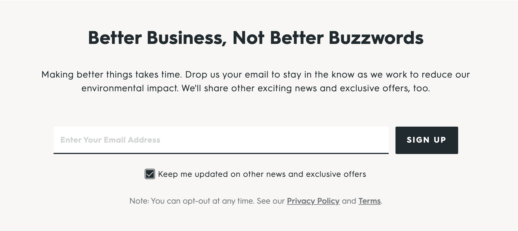
This example goes to show you that even professionals can make a mistake. And it again reinforces the importance of having a style guide. If he had been given a style guide, or if the designers had been working with one, they would have immediately been able to see that the photo didn’t make sense.

how to diy a STYLE GUIDE OR visual brand guide

When we’re talking solely about design, I prefer the term style guide. If we’re talking about the brand as a whole, down to the brand message and brand voice, I like the term brand guide. But I wanted you to be aware of both because they’re frequently used interchangeably.

So, whether you DIY’d your website and need to create a style guide, or your graphic designer didn’t provide you with one, let’s talk about how you can create your own.

Basics to Include in Your Style Guide

Here are the nonnegotiables you should include in a style guide:

  • Logo colors and usage: What are the correct proportions of your logo, and what colors should it only appear in?

  • Brand mark colors and usage: Do you have only a portion of your logo that gets used from time-to-time? If you look at your website tabs above, you’ll see that mine is just the lightbulb part of my logo. (This section of your style guide can also include icons that you frequently use.)

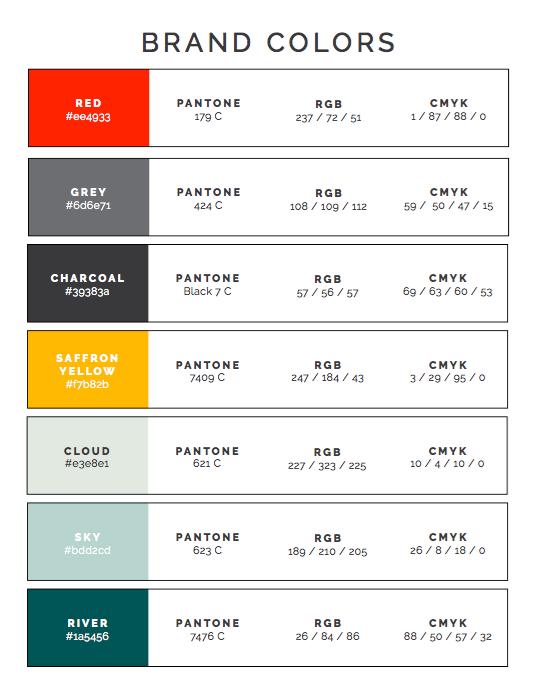
  • Brand color palette: You’ll likely have two to four main colors that should be front-and-center at all times. Then you should have another two to four-ish that get used only as accent colors. As an example, my primary colors are red, yellow, and light gray. My accent colors are a teal, dark gray, and two other green-ish colors. Of course, they all have fancy names, but this gives you an idea.

  • Typography: What are your fonts? You probably have a primary font and one or two secondary fonts. My primary font is Raleway and my secondary is Arvo. This gives me a sans serif font and a serif font to play with.

“Let your branding be a reflection of your values. Design trends come and go, but values rarely change. Personal values (honesty, courage, kindness) spill into your business. It's a great place to start when thinking about how you'd like to translate your business to the visual space.”

- Madison Beaulieu of Mad + Dusty


other ideas IN CASE you want to go the extra mile:

  • Mood board to give examples of colors, photos, and textures

  • Basic details about your organization that might affect the visual design, such as values

  • Key messages to keep in mind and reinforce when sharing in different formats such as a website or social media

  • Contact info in case there are any questions or decisions to be made


Want to include the entire kitchen sink?

Create a brand guide that encompasses the A to Z of your organization. One of my clients has a brand guide that’s 100 pages—no joke! But you don’t have to go that far.

Here are additional components for your brand guide:

  • Examples of what was done well in the past

  • Market research or details about your target audience, including words and emotions that represent them and what they’re looking for from your organization

  • Goals and objectives for different mediums, such as how specific stories should be used or what is considered a win

  • Brand message and brand voice, including words and sentiments that should and shouldn’t be used


Which is right for you?

I think just starting with a basic style guide is a terrific idea, especially if you’re a small nonprofit, social enterprise, or social impact company. If you’re a little larger, or frequently utilize contractors and freelancers, I think you should expand your guide to ensure that your brand stays tight, even as it grows.


SIGNIFY’S Brand Guide As An Example

Want to see what a brand guide looks like? Here’s mine!

Click the image below to see the full, nine-page PDF.


3 PRO TIPS to Help You Keep Your Brand Consistent

1) Pinterest

What do you do if you don’t have a graphic designer handy, don’t know what your colors are outside of “green” and “blue", or don’t consider yourself a style guru?

You turn to Pinterest!

And you thought it was only for recipes and hair styles . . .

Head on over to Pinterest, and type in some variation of “color scheme", such as “light green color scheme”, for example. There are thousands of color palettes already put together by professional designers that you can use!

Just type in one or two colors plus “color scheme” or “color palette” and you’ll be amazed at what you see. This is exactly what I suggested to my nonprofit client above, and they quickly found one that worked for them.

2) Canva

I can’t believe how many people still don’t know about Canva! This amazing (and free) website lets anyone become a competent graphic designer. There are hundreds of templates for social media posts, presentations, flyers, and much more. You can even pre-set a couple of your main brand colors so that they’re always handy.

But use responsibly!

Just because you have so many templates at your disposal doesn’t mean you have to use them all! The idea is to create consistency, right? Find a template that can be used over and over again for social media posts, brochures, flyers, presentations, and more.

My Canva account is set up for my social media posts, Pinterest posts, and more. So, when I or my interns log in to create new ones, all we have to do is make a copy of a previous design. This keeps the same look and feel intact each and every time. Remember, you want a brand that is recognizable.

3) Professional Photography

Of course, we can’t talk about a style guide or brand identity and leave out photography. But if you don’t have a photographer on staff or aren’t planning a photo shoot anytime soon, you want to find photos that both look good and also fit within your color scheme.

For this purpose, I like Unsplash. But other great options include Pexels, Pixabay, and Pikwizard. These are all royalty-free sites, meaning you don’t have to pay to use the photos. Choose whichever site has the best options for your brand.

In Unsplash, I have an account so that I can earmark photos that work well for my brand as I come across them. Because I post on this blog twice per month, I’m always searching for new photos, or looking to see what I’ve already saved. This not only makes them easy to find in the future, but again, my interns can choose from photos I’ve already approved.

Before I go, let me reiterate: I still suggest working with a professional designer whenever possible. They can help you set up colors and templates to use on your own when you can’t afford them, or are capable of creating something in-house. I never would have achieved the consistency that I have no without help from the pros in the beginning.


PIN THIS POST FOR LATER:

Does your nonprofit or social enterprise website look like it’s worthy of the dollars you’re asking people for, or does it look like you’re still trying to get your act together?

Kristi Porter, founder of Signify

I’m Kristi Porter, and I help cause-focused organizations understand and execute effective marketing campaigns so they can move from stressed to strategic. Your resources may be limited, but your potential isn’t. Whether you’re a nonprofit, social enterprise, or small business who wants to give back, I’ll show you how to have a bigger impact.